Capital City
The Scottish Gallery, Edinburgh 2019
FOREWORD by Guy Peploe
Foreword by Guy Peploe
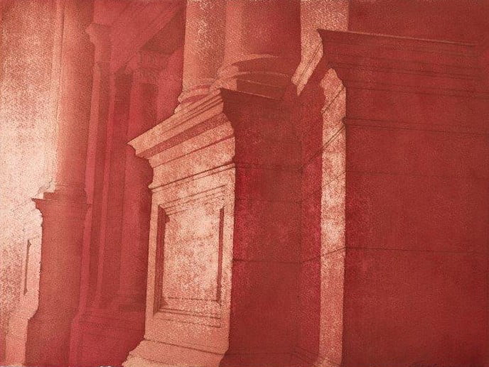
We present Hugh Buchanan’s Capital City, an exploration of the character of Edinburgh, viewed through the multiplicity of its capitals and columns. We particularly thank Adam Wilkinson and the artist for their written insights. The Classical tradition of the city is present in the proportion and detail of so many of Edinburgh’s great buildings, but light, or the lack of it, defines the city’s character. Buchanan’s palette, the servant of light, is timeless: he rejoices in gloomy veils of time as well as in contemporary tungsten, neon, or clear daylight. The sharp detail derived from his extraordinary watercolour technique emerges from the sub fusc, but Buchanan is not content with the traditional, ambient charms of his medium and will take a piece of emery paper to his surfaces, to reveal light again, by removing the pigment and nap of his heavy-duty paper. Thus, he creates a spotted effect which recalls Warhol or Lichtenstein, or an intense, brilliant hotspot, as if the architectural form has been dissolved in sunlight or magnesium flash. The conception of some of the paintings in series, or blocks of four – the final tonal applications of paint being something like screen prints – also recalls the work of Warhol and that of another great printmaker and biographer of Edinburgh, James Pryde. Elsewhere, patterns of dappled light float like lichens over the stone of the Royal Scottish Academy. The Petra-red, stolid, stove-pipe columns of the Caledonian Hotel speak of a dusty, industrial history and the Leith Customs House is rendered like an ancient silver-gelatin print. Old College becomes a portal of grim authority and we look up to the Corinthian detail of the columns of the Signet Library as if through tinted, limpid water, the city inundated like a vision of Atlantis. Buchanan’s references are not limited by any identity: he appeals to human history in the form of Edinburgh, as Shelley invokes Ozymandias, but makes contemporary images as enigmatic as any modernist and as cogently beautiful as a Renaissance master.
CAPITALS OF THE MIND by Adam Wilkinson
CAPITALS OF THE MIND by Adam Wilkinson
A great translator, when approaching a poem or piece of prose, does not just translate each word for word with an outstanding technical competence, but goes further, bringing the reader’s focus onto the weft and weave of the piece, understanding the texture and real meaning as much as the language itself.
Hugh Buchanan is an outstanding translator of the language of Classical architecture. It is a language that many have forgotten how to speak, driven to incoherence by the lack of a clear vocabulary in the Babel of contemporary architecture and townscape. Classical architecture of all ages – Ancient Greek, Roman, Palladian, Neo-Classical and, sadly rarely, modern Classical – all use the same vocabulary. At its most simple, this includes a base, a column, a capital and some form of entablature. It creates a dialogue across cities, across time and across cultures. The vestiges of this vocabulary are to be found in every modern house churned out by the mass house builders as an echo of a forgotten time – their products still include a skirting board, which acts as the base for the column of the wall. However, the capital, which in a domestic setting forms the decorative plasterwork cornice, has been lost, at best to a piece of plastic coving.
This loss of the Classical language was deliberate. In the inter-war years in central Europe, and in the post war era, Classical architecture was rejected wholesale and a New Jerusalem was built in the modern style where bombs and the wrecking ball had done their work. That rejection must, in part, have been influenced by the way in which the totalitarian regimes of the 1930s and 40s sought to align themselves with the glories of the Classical past through the use of its architectural forms, but now, over seventy years on, even the reasons for the loss of that vocabulary have been forgotten.
A hundred and fifty years earlier, Classical architecture was owned by those who aspired to a better world. Its strict forms defined entire cities, no more so than in Edinburgh. It spoke of the Enlightenment, of the improvement of the condition of cities for their residents, of the education of their children – and also of their humanism. The Classical system of proportion, correctly used, does not soar as a Gothic vault, but encourages low horizons and a scale that feels accessible. As well as forgetting how to speak this language, we have forgotten how to teach it, yet a little study goes a long way to making sense of our towns and cities.
In this exhibition, Hugh reminds us of the ability of the language of Classical architecture to move us – not through oppressive displays of power, but through the movement of light. In an insta world, he creates a series of analogue filters to draw our focus to the most important parts of those poems in stone and plaster that he is translating for us. He shows us a beautifully studied Playfair capital bathed in light; or how layered pilasters, in becoming abstracted, can help us to consider the effect that the architect was really trying to achieve. Close-up study of both the drawings and the carved stones suggest that Playfair was especially particular about his stonework.
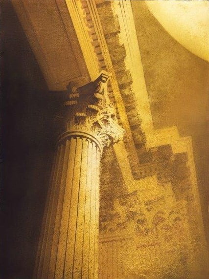
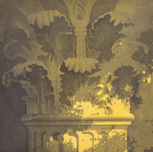
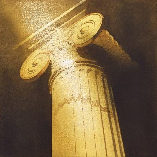
Buildings that should seem familiar become alien through the off-balancing use of colour and texture. Some of the paintings appear to have been faxed over to the gallery, making us look harder to understand them and making us literally see them in a new light. We see the mighty Doric order, with its fluted columns and simple capital, that speaks of Edinburgh’s self-aware alignment with Athens in the early 19th century. The volute scrolls of the Ionic order, sitting atop slender columns, find their way into so many commercial buildings in the city, but also to the College of Surgeons. There, they distinguish the discipline of its members from that of the physicians on Queen Street, belying their origins as barber-surgeons. Likewise, the Ionic is used to distinguish the National Gallery from the Royal Scottish Academy to its north on The Mound. The deeply cut acanthus leaves of the Corinthian order – craftsmanship of the highest order rendered for us, the viewer, by another craftsman – are reserved for the most important buildings, such as the libraries of the institutions, temples of learning.
This exhibition is an important achievement on two grounds. Firstly, a traditional medium is used with a traditional subject matter in an original way to challenge the viewer. Secondly, it reclaims and uplifts the Classical language of architecture as a language of intelligent aspiration amongst the meaningless chaos that is so often unthinkingly inflicted on our towns and cities. Let us hope that others follow.
INTRODUCTION by Hugh Buchanan
INTRODUCTION by Hugh Buchanan
In my most recent exhibition at the Scottish Gallery, in 2017, I celebrated 250 years of Edinburgh’s New Town. In retrospect, I felt that there were two areas of Edinburgh’s heritage that I could have developed further. Firstly, the extraordinary variety and quality of the city’s capitals and columns and, secondly, the texture of the stone itself. This exhibition explores both those areas.
To deal with the stone first. For many years now I have had a picture in my head, but was never able to get it down on paper. It was a picture of a corner of Robert Adam’s Old College. No corner in particular – any of a number of locations would have done. The grey stone would be stained with yellow and green lichen, scuff marks from generations of students and strike marks from the matches of countless smokers. I had always wanted to create a composition that encapsulated the character of Edinburgh through these textures, old and new, combined with the stern dignity of ancient Rome. Eventually, I realised that the key to this painting was in the preparation. I had to paint the stone first and the subject later. First of all, I had to find a very large, hard-wearing paper. I settled on a heavy-duty French paper – Arches. Then, through agonising periods of experimentation – of wiping and rubbing with rags – the texture of that stone began to emerge. Last of all, I had to find compositions that comfortably sat upon the random, accidental marks that I had created. So evolved the four paintings of Old College. The viewpoints were eventually higher than scuff marks and fag ends would ever have reached, but the feeling is the same.
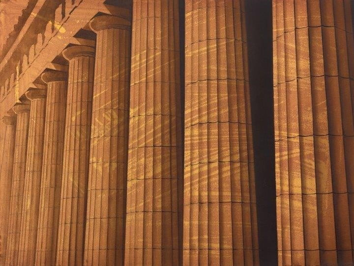
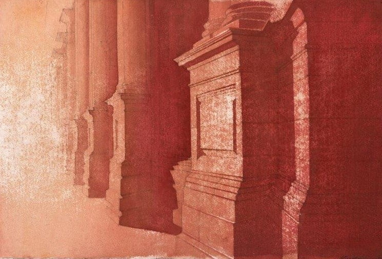
The paintings of the Royal Scottish Academy emerged in a different, warmer, palette, the colonnade abstracted to become, with its serried grooves, something like the Bridget Rileys on show inside at the time. And, in a warmer palette still, just along Princes Street to the west, the Locharbriggs sandstone of the Caledonian hotel became another subject. The red stone added warmth to the surprisingly complex rhythms of plinths and columns that make up the Caledonian’s facade. By painting on top of marks randomly applied with boards, I found that I could create something akin to a Hill and Adamson photograph and doubling back in my wanderings to Lauriston Place, I found that, by sandpapering my paintings of the portico of Edinburgh College of Art, I could create something close to the work of Monet. For the Bank of Scotland on the Mound, I again used texture applied with boards – horizontal this time – to suggest a printer about to run out of ink, a faulty TV monitor, or simply the building viewed across the street through Venetian blinds.
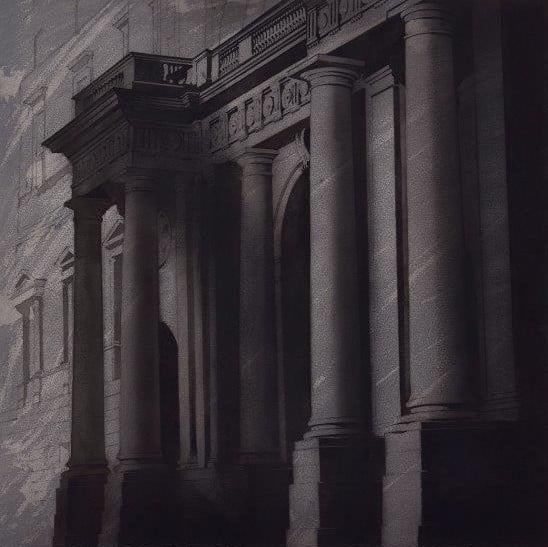
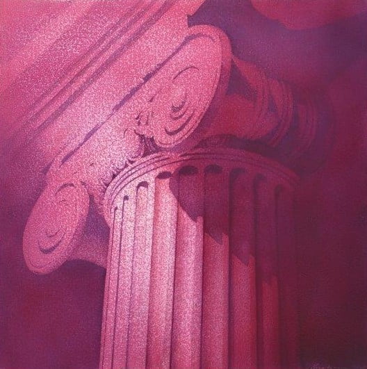
Returning for a moment to the façade of Old College and the capitals of the church of St Andrew and St George in George Street, I have used black on textured grey. This is what Edinburgh used to look like and, like many of its residents, that combination of colours has a certain gloomy charm. I have explored, as James Gunn did in his group portrait of G.K. Chesterton, Maurice Baring and Hilaire Belloc (NPG), the surprisingly different qualities of the various black pigments. Jet Black, Lamp Black and Ivory Black. Jet Black is the darkest; velvety and opaque, and has to be applied last. Always at the back of my mind is Magritte’s enigmatic tonal symphony The Black Flag (SNGMA), but, while black and grey may be the authentic colours of Edinburgh, new technology has seen Playfair’s lobby at the RSA lit with pink light and the Signet Library, the masterpiece of Playfair’s teacher William Stark, bathed in fluorescent colour. Some of my interiors reflect these developments.
Rivalling the Signet Library as Edinburgh’s finest interior is William Chambers’ Dundas House in St Andrew Square. I painted the exterior at night in 2017, but the hallway is just as magnificent and would have served T.S. Eliot equally well as London’s church of St Magnus Martyr as an example of that ‘inexplicable splendour of Ionian white and gold’ referred to in The Waste Land.
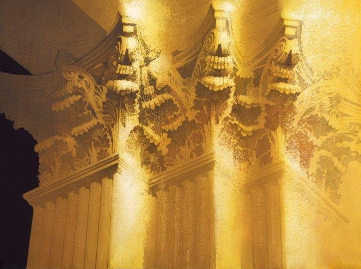
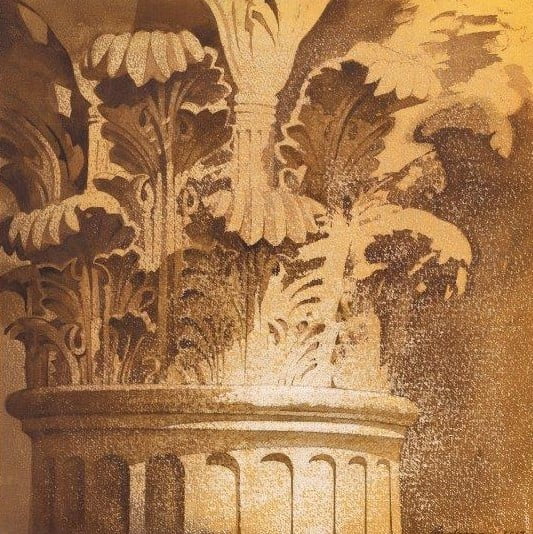
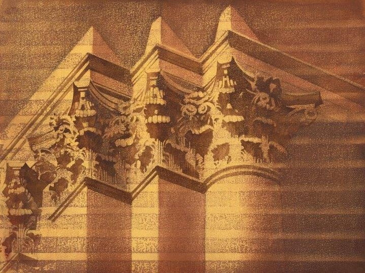
Light, how it enters a room or plays across a facade, is always at the heart of my work and, by choosing the corner of a room or a building, I aim to evoke the whole. So it was for me in the Signet Library. The soft light falling through the central cupola as it catches the dust motes, reminds me of Yeats’s Isle of Innisfree, where ‘peace comes dropping slow,’ or, perhaps, of Pink Floyd’s ‘million bright ambassadors of morning’ from the song Echoes. These dust motes I again evoke by rubbing with sandpaper on the heavily textured Arches paper. But, sometimes, the light can be fierce and direct as it strikes the gilded and burnished capitals at a low angle early in the year. Bouncing light, reflected light, irradiating the undersides of acanthus scrolls as well as their tops. Sometimes, in the shaded areas, I used LED spotlights to illuminate the subject at close quarters and, here, Stark’s exquisite mastery is revealed. With their gently splayed foliage bunched so close together that, in some areas they resemble a forest of sea anemones, these are surely Edinburgh’s most finely modelled capitals.
REVIEW
Trick of the Light
SCOTSMAN REVIEW by Duncan Macmillan
Hugh Buchanan revisits the New Town for a powerful series of paintings celebrating the architectural treasures of Edinburgh
The Enlightenment was just that. It brought light where there had been darkness, the darkness of bigotry that had consumed Scotland: the tyranny of belief only validated by the strength of its own conviction. David Hume and his friends were determined that truth validated instead only by experience should forever banish bigotry. The greatest monument of the Enlightenment they led was Edinburgh’s New Town. In volume of stone shifted it is the equivalent of the pyramids. Appropriately too, light brought in by wide streets and big windows was at the heart of the project. Light matters too for the classical detail that adorns its buildings. Originally designed for the white limestone and sharp light of the Mediterranean, it was adapted beautifully to the soft light of the north and the gold and grey stone of the city.
Hugh Buchanan celebrated the quarter millennium of the New Town (while the city largely ignored it) with a superb exhibition of Edinburgh’s Georgian architecture. Now he has returned with part two, he says, of the same project, not to repeat himself, but to take it in a new direction. Buchanan paints in watercolour, a medium uniquely suited to painting light and his previous show was literally luminous. But, as the wheels of history turn and the shadows threaten to overturn the Enlightenments legacy, so too light does not always illuminate. Bright light dazzles. It can seem to dissolve solid surfaces, make it difficult to see even as it illuminates and, casting deep shadows, it can bring darkness and obscurity into the full light of day. Some of this anxiety is reflected in the direction that Buchanan has taken in his new show. In it he paints details, especially capitals and columns, Doric, Corinthian or Ionian, and fragments of colonnaded facades, but whatever his subject, light dissolves or shadow threatens to engulf it.
He describes how first he paints heavy paper with the colour of stone. In different lights this can be black, grey, sepia, or under decorative lighting even pink. Then he attacks it with an abrasive, literally scrubs it away as though it really was stone. Under this attack the white paper shows through the paint as patterns of light or the texture of the stone. Then he finds the image in the painted and abraded paer. Thus, his process mimics the whole business of building with stone, an inert material, cut, polished, shaped, installed and then standing for centuries weathered by time.
In a superb series of grey-black paintings of the entrance to Old College, of other details of Adam’s building, or details of the Doric columns of the RSA, sweeping abrasions seem to reveal the stone’s geology before any human intervention, as the immensity of geological time dwarfs all human effort. Indeed, time seems to be the theme of these remarkable pictures. Sepia light suggests old photographs with their unique ability to collapse time past. Others are on paper roughly shaped and presented as though they were historic fragments, or in yet others the stone itself seems to be eroded as though, in some bleak future, like the sphinx, it had stood for millennia in some sand-blown desert.
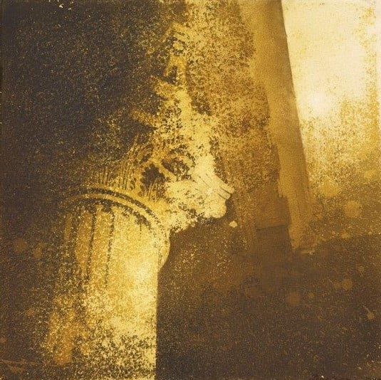
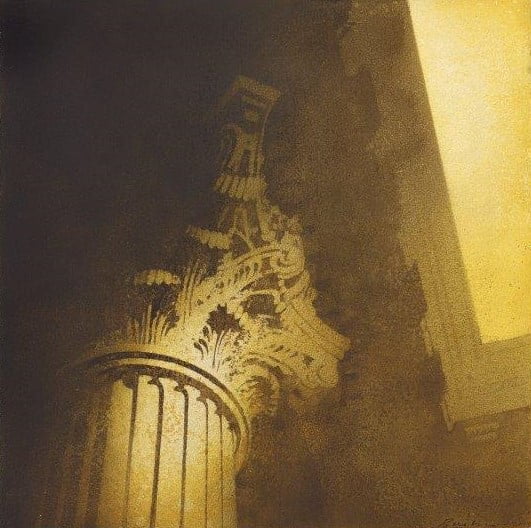
In a pedestrian’s view of the Caledonian Hotel in Lothian Road – Buchanan doesn’t limit himself to Georgian architecture – the dissolving light suggests Monet’s Rouen cathedral paintings. In them, too, the artist reflects on time, on history and the apparent solidity of things, but, at the same time and in contrast, under constantly changing light, their mutability and impermanence. In one picture Ionian White and Gold, a detail of a capital from Dundas House, Buchanan also quotes from T.S. Eliot’s’ The Waste Land. It is a poem about transience and permanence, about the persistence of memory across great stretches of time, just like classical architecture laden with its history over 2000 years or more. Eliot also contrasts all this collective memory with the mundane, transient details of life, day to day. In his pictures Buchanan invites us to look about us and like Eliot reflect on these imponderables.
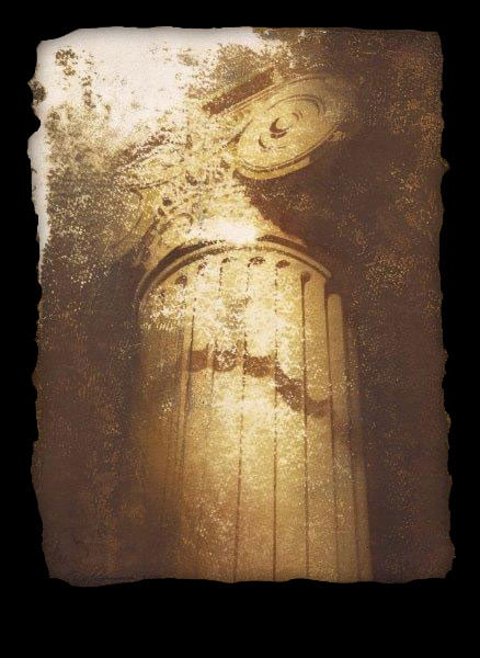
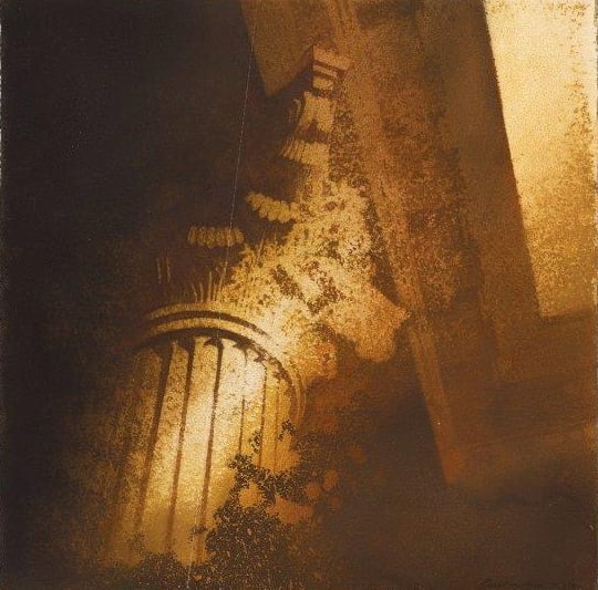
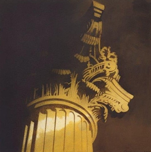
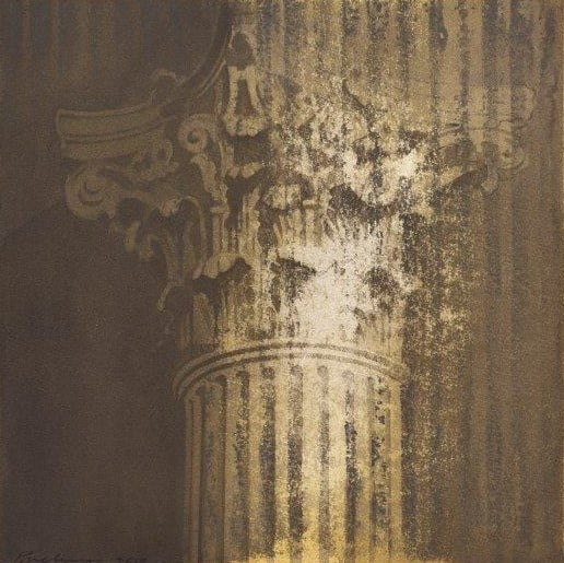
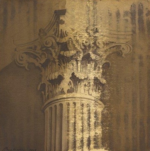
Signet Library Capital I 20 X 20 inches
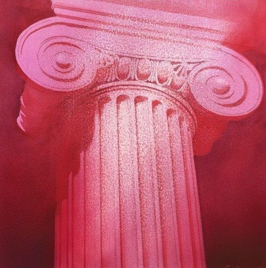
Ionian White and Gold Dundas House 20 X 20 inches
Signet Library Interior 40 x 30 inches
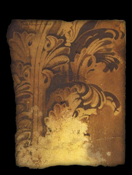
Signet Library Fragment 15 x11 inches
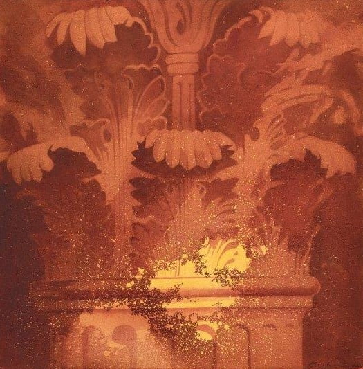
Burnished Gold The Signet Library 30 x 40 inches
Study for Ionian white and gold 15 x 11 inches
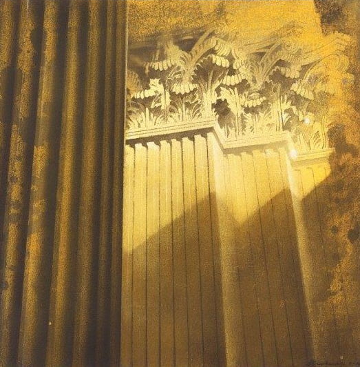
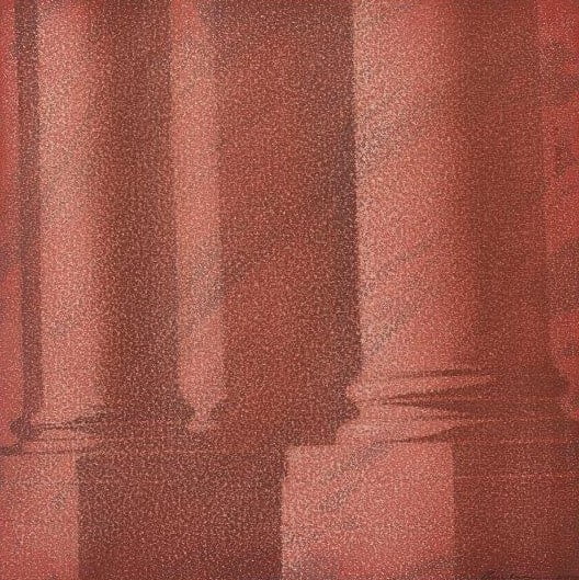
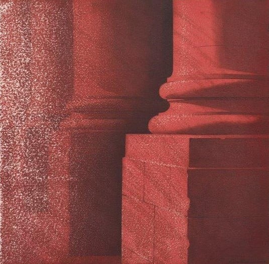
Corinthian Columns Signet Library 20 x 20 inches
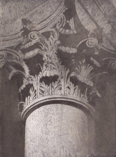
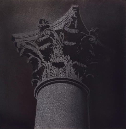
Signet Library I 20 X 20 inches
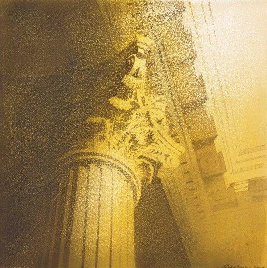
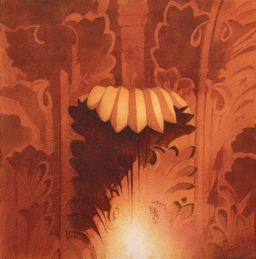
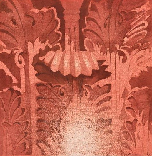
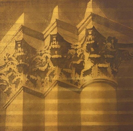
Signet Library Capital IV 20 X 20 inches
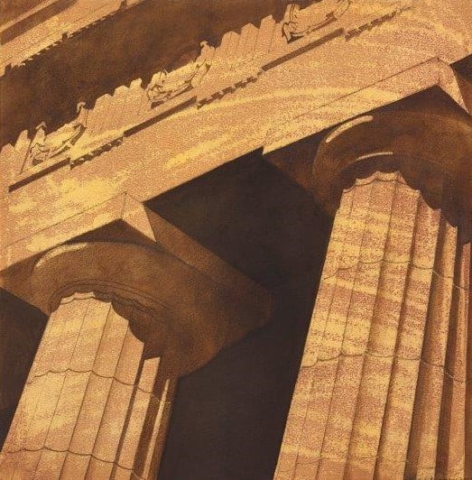
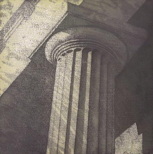
Triglyphs and Metopes RSA II 20 X 20 inches
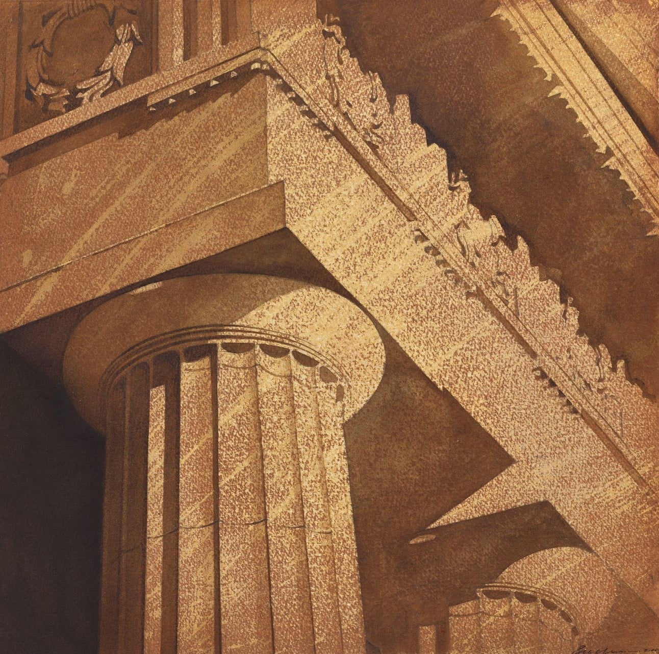
Triglyphs and Metopes RSA I 20 X 20 inches
Study for St Andrew and St George 15 x 11 inches
St Andrew and St George 26 X 26 inches
Signet Library III 20 X 20 inches
Signet Library II 20 X 20 inches
Signet Library Capital III 20 X 20 inches
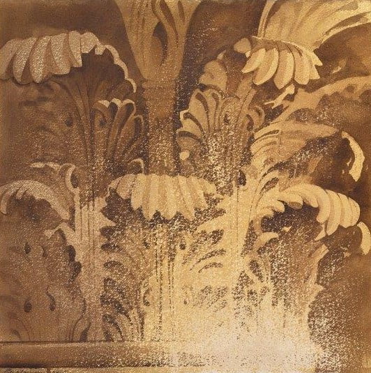
Signet Library Capital II 20 X 20 inches
Acanthus leaf II 20 x 20 inches
Acanthus leaf I 20 x 20 inches
Signet Library IV 20 X 20 inches
Morning Light Signet Library 20 X 20 inches
George Street Capital I 15 x 15 inches
George Street Capital II 15 x 15 inches
Collonade RSA 30 x 40 inches
Rutland Street 15 X 22 inches
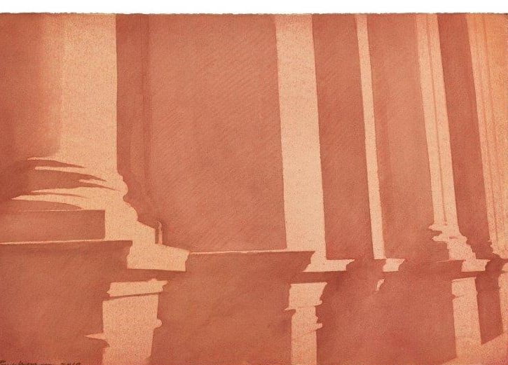
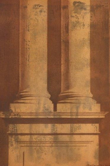
Old College 40 x 40 inches
Purple Playfair RSA 20 x 20 inches
Entablature RSA 20 X 20 inches
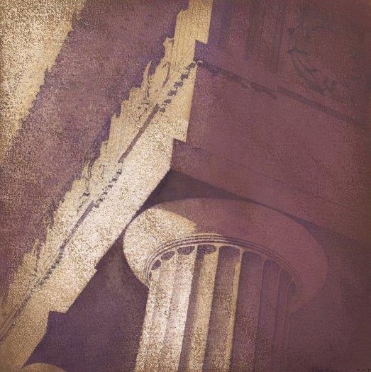
Pink Playfair RSA 20 x 20 inches
Customs House Leith 20 x 20 inches
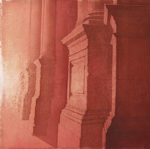
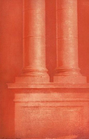
Caledonian Plinth III 22 x 15 inches
Caledonian Plinth II 22 x 15 inches
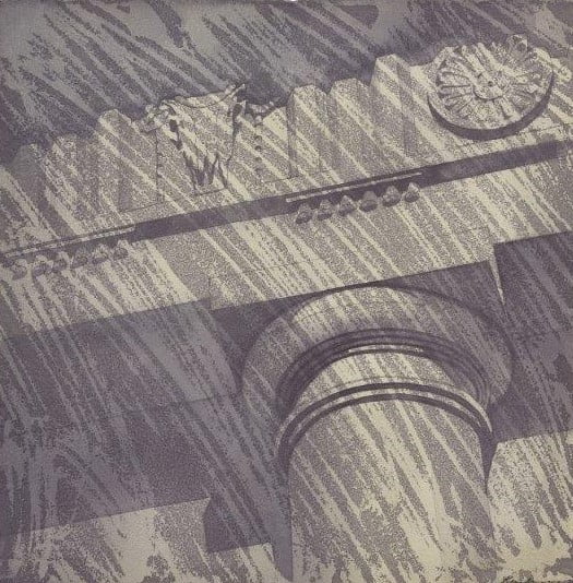
Bucranae Old College Quad Study 20 x 20 inches
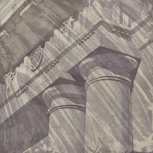
Bucranae Old College Quad 40 x 40 inches
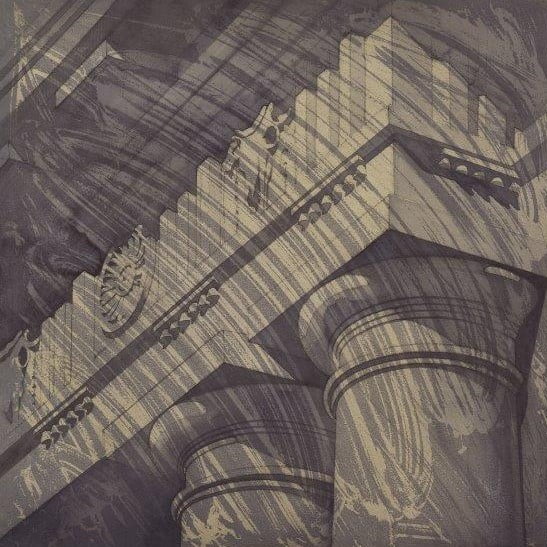
Bucranae Old College Quad 20 x 20 inches
Bryce Capitals Bank of Scotland 30 x 30 inches
Bryce Capitals Bank of Scotland 30 x 40 inches
Art College Painting (after Monet) 20 x 20 inches
Art College Painting 20 x 20 inches
Lothian Road I 15 x 22 inches
Lothian Road II 15 x 20 inches
Lothian Road III 15 x 15 inches